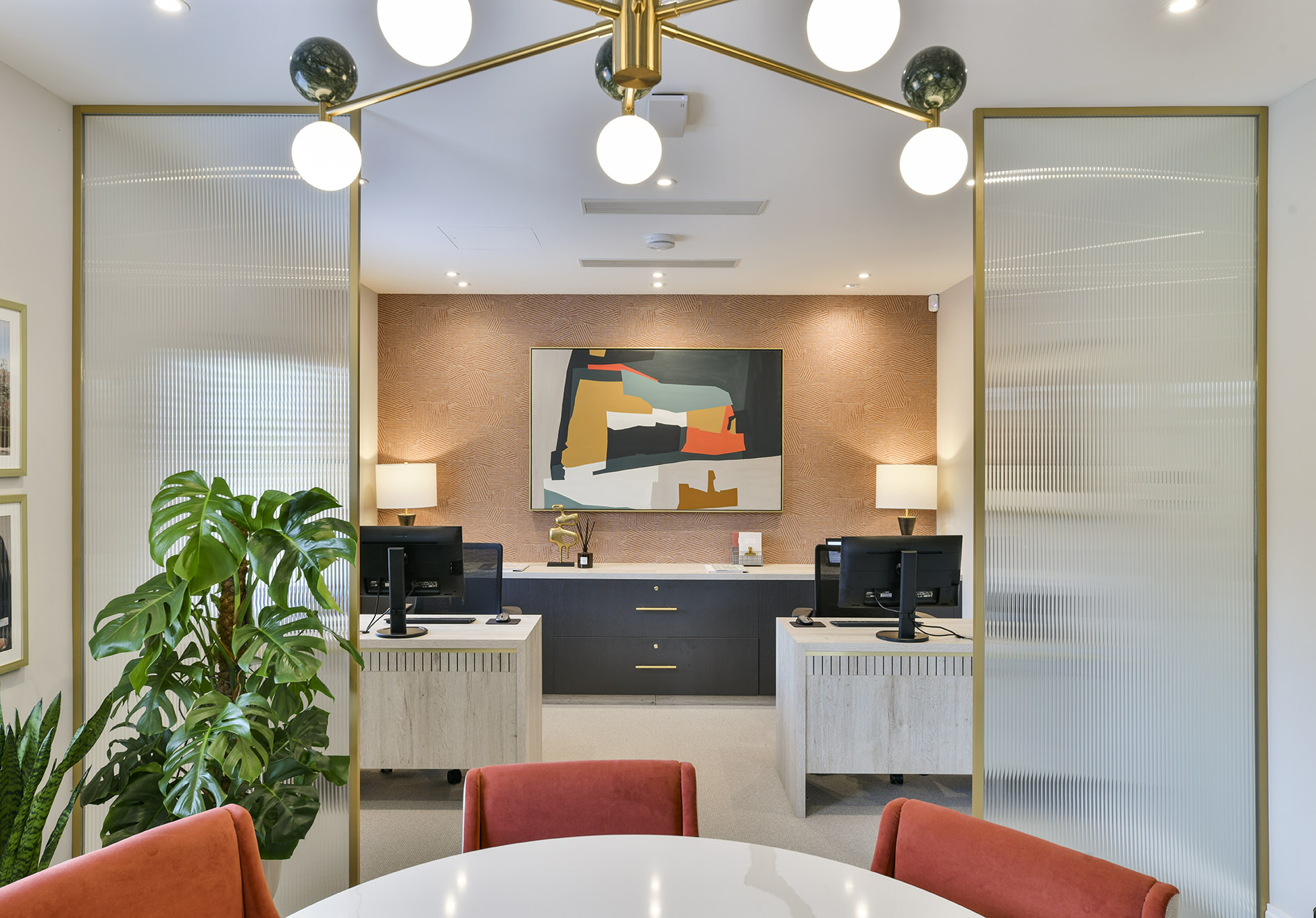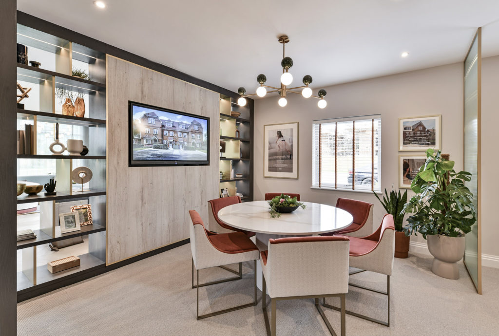
Marketing suites are the most effective tool to work in conjunction with your show homes to create an aspirational environment for potential customers. Your marketing suite will be the buyer’s first interaction with your brand so, it must demonstrate the quality they will receive when buying their home, both in customer service and product. We’ve spoken to our commercial team and gathered 3 key elements that you must include when designing your marketing suite in 2022.

Make it collaborative
When arriving at your marketing suite, you need your customer to feel at ease. This will be the first step into buying their home, which is a tough decision, so it’s your job to make it as seamless as possible.
In 2022, marketing suites have moved away from the traditional sales desk approach to an open, social and collaborative space. Your potential buyer is then free to walk around your suite comfortably and not feel pressured. The key is to break the barriers that a sales desk would bring and have team members spread around the open space to be on hand to help where needed and have multiple seating areas to get into a discussion with the potential buyer on a more relaxed basis.

Walls out, soft zoning in
Traditionally, marketing suites would have walls to break up a space and create privacy for the team to discuss details with the potential buyer. However, this layout then creates a barrier for buyers who wish to walk freely around before making the decision to discuss things further with the team.
Soft zoning is a great way to create segregation within the suite without using solid walls to block the clients’ view, this is best implemented by using lower-level zoning. This can be achieved by using the following:
- Different flooring to segregate the areas, this can be within the colour, pattern, or a completely different type of flooring
- Adding a low-level partition that doesn’t block the view from the front to the back of the marketing suite
- Using pieces of furniture such as a TV and table which can then be doubled up to show potential buyers the online brochure or design plans

Don’t be spoilt for choice
Have you ever been to a restaurant that has a huge menu, and you just don’t know what to order? Well, this is what happens when a buyer is presented with a display full of many fabrics, lighting, furniture, paint choices, and more to choose from; they simply can’t decide on which direction to go in.
For your marketing suite, we recommended showing a maximum of 4 options for your buyer to choose from, and the way you display these options is what will set you apart. People buy what they see, they’re not able to visualise a paint colour unless seen on a wall or a backsplash tile unless seen against the cabinets so, show them! People buy with their eyes and if they can walk around and experience the 4 schemes that are offered, they will most likely go with this rather than making changes and adding complexity to their decision as you’ve allowed them to visualise their life within this space.
The main aim of your marketing suite is to give the buyer comfort and confidence in purchasing from you as opposed to another developer and the 3 steps above will bring you one step closer to making that happen.
Explore our marketing suites portfolio here.